

Mastering the Art of Color Grading: The Importance of Color in Visual Storytelling and Common Mistakes to Avoid
Why do we need to color grade?
Today’s video cameras are incredibly powerful. Although they can capture an insane amount of detail, your images may not look good straight out of camera. Most professionals will tell you that in order to make your content really pop, you need to do some color grading. This is largely due to the fact that our cameras are so powerful that they record in a flat profile to capture as much light information as possible.
Color Grading is the finishing process of video and image editing. It is achieved by adjusting and enhancing the image by manipulating the color properties in the image.
Most common adjustments are:
- Color temperature
- Saturation
- Hue
- Contrast
- Exposure.
- Skin tones
In a nutshell, the overall goal of color grading is to make all shots in a sequence match or compliment each other in some way. As well as make any people in the frame look as good as possible for the sake of the story you’re trying to tell. There are many techniques that can make important subjects in frame (products or people) “pop” off the screen to grab your viewers attention..
In this article we will touch on many of the basic principles of why color grading is so vital to your digital assets . We aim to educate you on why color is so important and explain why you should hire a professional like DV to take your footage to the next level.
Understanding Color Theory:
Although color is a subjective artform, and everyone has different tastes, there are “rules” that tend to work to make good looking images.
To make a great looking image, it’s important to use some basic color theories as a guidline. These philosophies not only apply to video editing and graphic design but also any visual artform.
Understanding color theory principles:
There are a few important things to understand when adjusting colors in an image. Although this is an in depth topic in this article we feel understanding the basics will help you better understand the importance and expertise of these services.
Understanding the color wheel: The color wheel shows us the spectrum of color. Weve all seen it. Its a guide to see all the main colors in the visible spectrum and where colors are in relation to each other. In the color wheel we have primary colors ( red , green and yellow), secondary colors(green, orange and purple) and tertiary colors ( mixtures of primary and secondary colors like red-orange). Understanding this wheel will help you understand how colors interact with each other.
Understanding Color harmony: Color harmony refers to how balanced an image is. An attractive image will have balance. It has both yin and yang. Dark and light elements will create the shape on the 2d plane. Common ways to balance an image is by using complementary colors ( colors opposite to each other on the color wheel for example: cool is opposite to warm ). Another popular color scheme is Analogous colors. This palette uses colors close to each other on the color wheel. This will give our image less contrast but has a solid color theme that stays within each color space.
The Importance of Color Grading in Video Production & Graphic Design
Color Grading your digital assets can give them a professional touch that helps them appear top tier, not only engaging your audience longer, but building your brand in the process. When you have a colorist grade your video footage it also insures that all future assets will match your older assets. Nothing is worse than seeing content from last year that doesnt match your new content. When you predetermine your color pallet of your Branded assets all your content matches no matter when it was made.
Color Grading insures your assets:
- Look great
- Stay “On Brand”
- Have a cohesive look across scenes and different cameras
- Setting the mood and tone of the story
- Guiding the viewer’s attention and focus
The Color Grading Process
The color grading process begins with deciding the creative direction for the project. We usually start with a list of reference material to look at and this gives us our creative direction. We also consider content ideas for the future so we can remain on brand with the future assets you create.
Software and Tools:
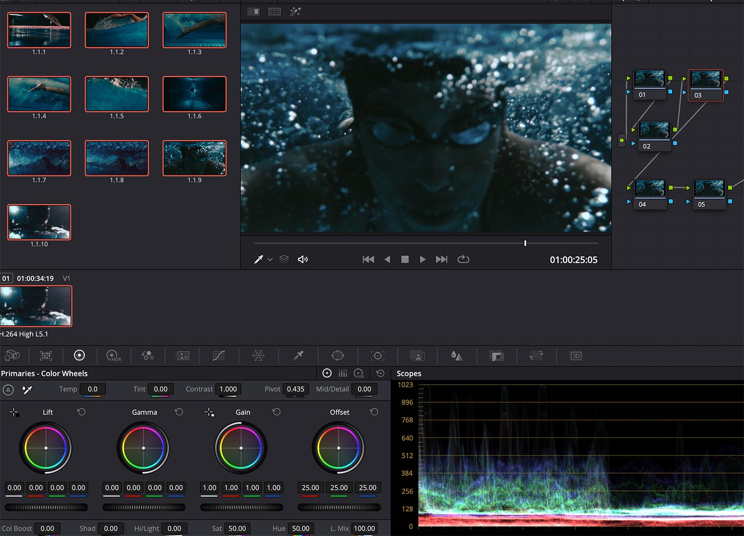
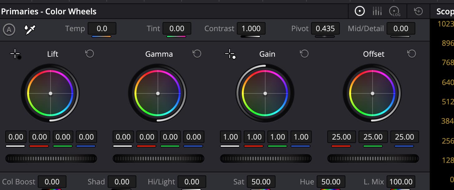
We color grade on Industry standard color grading programs used by most professionals. Our software of choice is Davinci Resolve by blackmagic design. We also use an advanced control panel to tweak and adjust each color to perfection.
Uploading your footage:
In order to maximize your grade, we will need your file in the highest video codec possible. We recommend nothing lower that Apple Prores 422 and make sure your footage is flat with no transitions or titles baked in.
Collaboration Sessions:
In order to grade each project as you wish, we offer collaboration sessions where we can go over the footage and references and work together to get the grade to your liking.
Common Color Grading Mistakes and How to Avoid Them
There are many mistakes amateur editors make that can destroy your footage. Here are a few things to avoid when coloring your project.
- Over-saturating or under-saturating footage
- Incorrectly balancing color temperature and tint
- Neglecting color contrast and dynamic range
- Ignoring the impact of color grading on skin tones
Let us help elevate your Brand image with color grading
As we have explained, color grading is a vital element in applying the finishing touches to your video content & graphic imagery. The color of your content directly affects the mood. At Dreamvision Media™ we have extensively studied color theory to help our clients carefully craft the aesthetic they are trying to reach. This will not only make your video more pleasing to watch, but also better communicate your message to your target audience and stay on brand.
We offer in-studio as well as remote color grading services. If you need help coloring a project contact us below.